Great UI design isn’t about finding one hero image. It’s about finding five hundred boring utility images that look like they belong to the same family.
For product teams, the real enemy isn’t lack of creativity. It’s scale.
How do you keep a consistent visual language across an iOS app, a marketing landing page, and a sales deck without hiring a full-time iconographer?
Icons8 tackles this problem not just with volume, but with strict architectural discipline. With over 1.4 million assets, the library operates less like a chaotic marketplace and more like a standardized utility for design systems.
The Architecture of Consistency
Most icon sites suffer from “style soup.” You search for a home icon and get a mix of line weights, corner radii, and conflicting perspectives. They clash immediately when placed side-by-side.
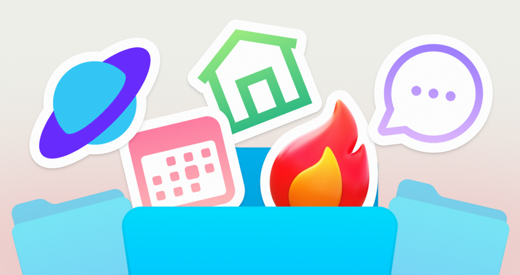
Icons8 generates massive sets-often 10,000+ icons per style-that adhere to rigid platform guidelines. You aren’t just looking for a “thin line” icon. You search for the “iOS 17 Outlined” pack to match Apple’s native interface. Building for Windows? The “Windows 11 Color” or “Outline” styles align perfectly with Microsoft’s Fluent Design.
This structure solves the “missing metaphor” problem. Teams can commit to a specific aesthetic, like Material Design or the playful 3D Fluency, knowing they won’t run out of assets halfway through the project.
Workflow Scenarios
To see the real utility here, let’s look at how different roles use the library during a product lifecycle.
The UI Systems Designer
Picture a designer prototyping a fintech application. The brief calls for a clean, trustworthy aesthetic similar to standard banking apps.
- Selection: They choose the “Material Outlined” style. This ensures immediate familiarity for Android users.
- Integration: Instead of downloading files manually, they open the Figma plugin. This keeps them inside their design environment, dragging and dropping vectors directly onto the canvas.
- Customization: The brand uses a specific navy blue. The designer uses the bulk recolor feature within a Collection to apply the hex code to fifty banking icons (wallets, transfers, charts) at once.
- Expansion: A product manager requests a niche feature: “biometric loan approval.” The designer finds that exact metaphor in the same Material style. Because the pack contains over 5,000 icons, they avoid drawing a custom vector that might look slightly off-brand.
The Frontend Developer
Design handoff is complete. Now the developer needs to implement these assets without bloating the codebase.
- Format Choice: They skip PNGs to ensure crisp rendering on retina displays. It’s SVG for static elements and Lottie JSON for interaction states, like a menu burger morphing into an ‘X’.
- Optimization: Before downloading, they uncheck “Simplified SVG” in the settings. This preserves the path structure, allowing them to animate specific parts of the vector using CSS later.
- Embedding: For the marketing site, they use the CDN link or Base64 HTML fragments provided on the asset page. This allows for rapid updates. If an icon needs to change, they update the link rather than the file structure.
- Animation: The “Success” modal needs pop. They download a pre-made animated JSON file that matches the static icons used elsewhere. The motion design feels connected to the static UI, not like an afterthought.
A Narrative: The Marketing Sprint
It’s Tuesday morning. A content manager is handling a product launch. The design team is unavailable, but a blog post needs to go live in an hour.
The manager opens Pichon, the Icons8 Mac app. It acts as a drag-and-drop bucket for the operating system. They need a header image for a post about “Cloud Security.”
Searching for “Cloud” and “Lock” in the “Liquid Glass” style adds the necessary visual flair. They drag the 3D-style icons directly into a Photoshop canvas. No browser tabs required.
Next, the landing page needs a favicon. They find a simple “Shield” icon in the web interface. Using the in-browser editor, they add a solid background color to make it visible on a browser tab. They use the “Text” tool to overlay a small “V1” on the shield to denote the version. Finally, they download the specific “Favicon” format, already optimized for desktop and Android Chrome.
The entire process takes fifteen minutes. No external design software needed.
The “Secret Weapon”: In-Browser Editing
The library size grabs headlines, but the in-browser editor accelerates workflows. It lets non-designers perform vector-level operations without learning Illustrator.
- Recoloring: Forget basic black or white. Apply specific HEX/RGB values to match brand palettes before the file hits your hard drive.
- Overlays and Subicons: This is a lifesaver. You have a “User” icon but need an “Add User” variant. Use the editor to drop a “Plus” sign subicon over the original. Resize, move, and recolor it instantly.
- Padding and Containers: Developers love this. Add a square or circle background, adjust the corner radius, and fix the padding. This ensures every export is exactly 24x24px, regardless of the icon’s visual weight.
Alternatives and Comparison
Icons8 isn’t the only option. Here is how it stacks up against other sourcing strategies.
- In-House Design: The gold standard for uniqueness. But it’s slow and expensive. If you need 500 icons, prepare for weeks of work. Icons8 wins on speed and volume, though you sacrifice exclusive ownership of the shapes.
- Open Source (Feather, Heroicons): Excellent for small projects and completely free. But they usually cap out at 200-300 icons. Need complex concepts like “artificial intelligence” or “logistics”? You will hit a wall. Icons8 covers these niche metaphors.
- Flaticon / Noun Project: These are aggregators. They host millions of icons from thousands of different authors. Finding 50 icons that look like they were drawn by the same hand is a struggle. Icons8 keeps production largely in-house or strictly curated, resulting in superior consistency.
Limitations and When to Look Elsewhere
Every tool has trade-offs.
- The Free Tier Cap: Free downloads are limited to PNGs up to 100px. In modern web development, 100px raster images look blurry on high-density screens. For professional production, the paid plan (unlocking SVG and high-res PNG) is practically a requirement.
- Generic Metaphors: The library relies on universally understood symbols. If your brand depends on abstract, avant-garde imagery that challenges UI conventions, these icons might feel too functional.
- Attribution: The free tier mandates a link back to Icons8. For commercial client work or white-label apps, this is often a dealbreaker, necessitating a subscription.
Practical Tips for Power Users
Don’t just use the search bar. Try these workflows to get more value:
- Use Collections for Bulk Actions: Never download icons one by one. Drag everything into a Collection. Recolor the entire batch in one click and download them as a sprite sheet or a set of SVGs.
- Leverage the Request Feature: Missing a specific metaphor? Check the Request section. The community votes on missing assets, and Icons8 produces the winners. It’s a way to get custom work done for free if enough people agree with you.
- Check the “Popular” Category: On a strict budget? The “Popular,” “Logos,” and “Characters” categories offer all formats (including SVG) for free, provided you attribute. It’s a great entry point for testing vector compatibility.
- Search by Image: Have a low-res bitmap of an icon you like? Use the visual search to find the closest vector match in the library.
Icons8 bridges the gap between limited open-source packs and expensive custom design. By focusing on deep, style-consistent packs, it lets teams scale their interfaces without breaking their visual language.
